This Elementor widget enables you to include an interactive search form on your page. Once you add this widget to a web page, you get the following settings to customize it further.
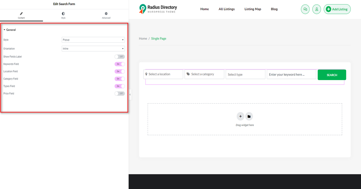
On ‘Content’ tab and under ‘General’ section, you’ll see:
1) Style: Use this option to choose your preferred form style from ‘Popup,’ “Auto Suggestion,” and ‘Standard.’
2) Orientation: It lets you select an orientation, such as ‘Inline’ or ‘Vertical’, for the Search Form.
3) Show Fields Label: Toggle it on or off to display or hide search field labels.
4) Keywords Field: Switch it on or off to include or remove the keywords field from the Search Form.
5) Location Field: Utilize this option to showcase or hide the location field from your search form.
6) Category Field: You can turn it off to hide the category field from the Search Form or do the opposite to display it.
7) Types Field: Include or exclude the type field from the Search Form with this option.
8) Price Field: This option allows you to add or remove price fields from the Search Form.
Style #
This tab allows you to design your search form the way you want. It’s got three major settings: General Style, Fields, and Button Section. Here are the details about these settings.
General Style #
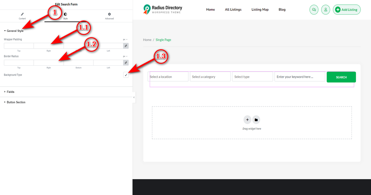
When you click the “General Style” settings, you get the following:
1.1) Wrapper Padding: This feature helps you adjust the internal space within the search form container.
1.2) Border Radius: This option controls the roundness of the Search Form’s background border.
1.3) Background Type: This setting allows you to define the background style of the search form. You can include colors and images.
Fields #
This style setting allows you to design your search form fields. Once you click on ‘Fields’ setting, you’ll see these options below.
1) Field Text Color: It allows you to change text color inside the input fields of a search form.
2) Field Background: With it, you can set the background color for the input fields of the Search Form.
3) Field Gutter Spacing: It controls the space between each input field inside a container.
4) Field Height: You can adjust the height of input fields of a search form with this option.
5) Border Type: This allows you to choose the style of the border of each input field, such as solid, dashed, or dotted.
6) Border Width: This setting controls the thickness of the border around the input fields.
7) Border Color: Use it to set the color of the border of each input field of a search form.
8) Border Radius: Adjust the roundness of the corners of the input fields using this option.

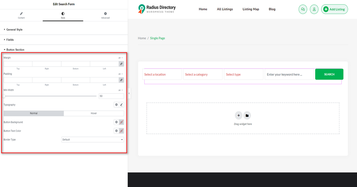
Button Section #
With “Button Section” setting, you can customize the Search Form button as you wish. Here are the options it contains.
1) Margin: It lets you adjust the space around the button.
2) Padding: With it, you can control the internal space inside the button.
3) Min Width: Increase or decrease the width of the button using this slider control.
4) Typography: Set the font style for the button in normal and hover states with this option.
5) Button Background: It enables you to select the background color of the button.
6) Button Text Color: Customize the color of the text on the button using this option.
7) Border Type: It helps you specify the border style for the button, such as solid, dashed, or groove.