This Elementor widget allows you to include buttons like ‘Compare,’ ‘Favourites,’ ‘Chat,’ ‘My Account,’ and more at the top of a page to ensure easy navigation. Let’s explore its settings.
The ‘Content’ tab on the left-hand side has these settings: General, Content Visibility, Compare, Favourites, Profile, Chat Option, and Add listing button.
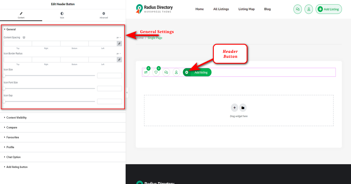
General #
It has the following options:
1) Content spacing: This box control element lets you set the spacing around icons.
2) Icon Border Radius: This box control UI element allows you to set the border radius (rounding of corners) for an icon.
3) Icon Border Size: You can increase and decrease icon border size using this slider control.
4) Icon Size: This slider control allows you to expand or reduce the size of the header button icon.
5) Icon Gap: Use it to enlarge or shrink the gap between header buttons.
Content Visibility #
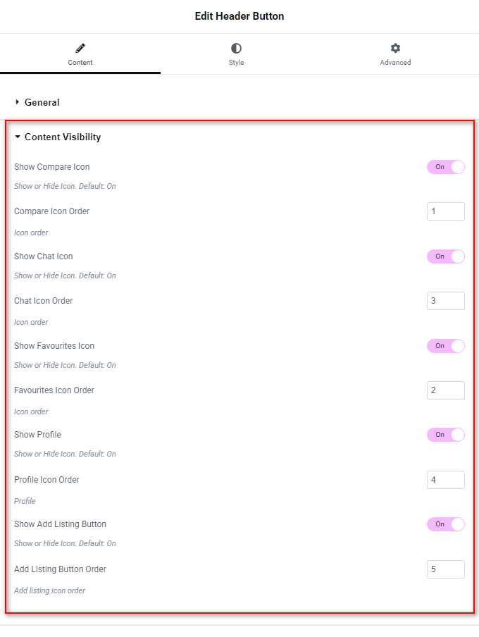
The “Content Visibility” setting has options to enable you to display or hide several header buttons such as ‘Comapre,’ ‘Chat,’ “Add Listing” button, and so on.
Compare #
The ‘Compare’ setting has a “Cart Icon” option to change the ‘Compare’ button icon.

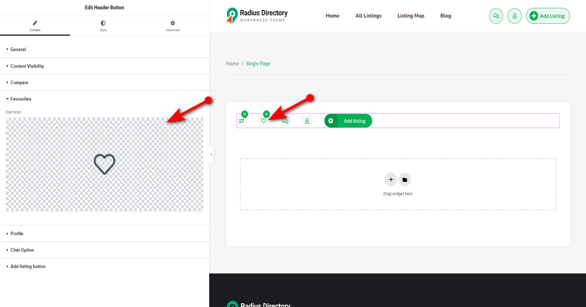
Favourites #
This one has a similar option to the ‘Compare’ setting to replace ‘Favorites’ button icon.
Profile #
Similar to the ‘Compare’ and ‘Favourites’ settings, this one also has a setting to change the profile button icon.

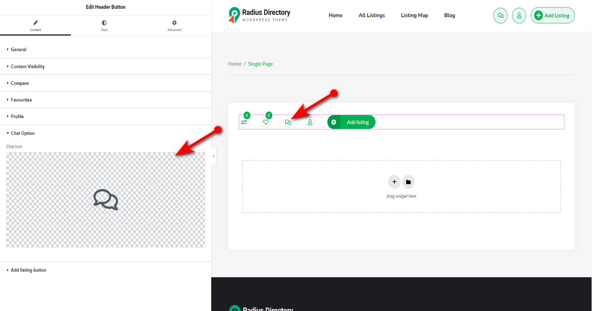
Chat Option #
The “Chat Option” also has a UI section to help you add a chat icon for the chat button.
Add listing button #
“Add listing button” has several options to customize the add listing button according to your preferences. Here are those options:
1.1) Button text: This field allows you to write the “Add listing button” text.
1.2) Add Listing Icon: With this UI section, you can change “Add listing button” icon.
1.3) Button width: This slider control lets you control the width of “Add listing button.”
1.4) Button Height: You can increase or decrease the height of “Add listing button” with this slider control.
Style #
This tab helps you work on the design of the “Add listing button” icon and the button itself. This tab has two primary settings—one for the icon and another for the button. Let’s explore these.
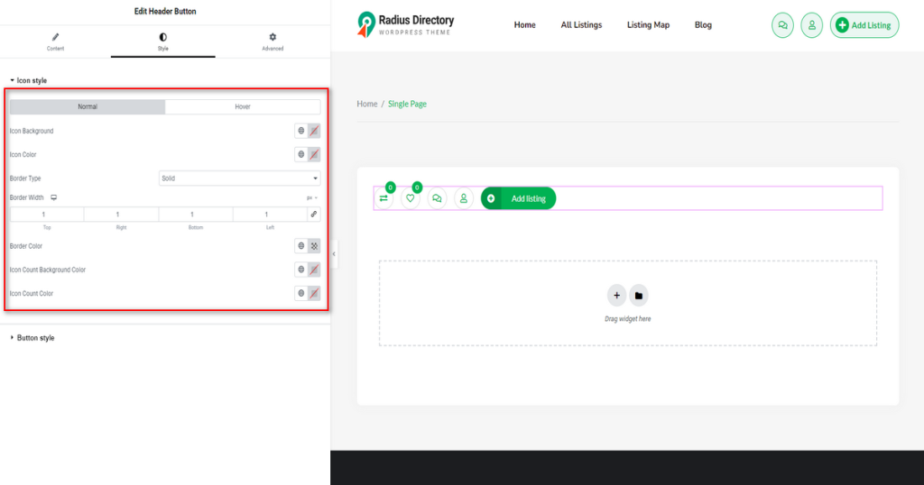
Icon style #
This setting enables you to change icon color, icon background color, its border type, border width, border color, icon count color, icon hover background color, and more.
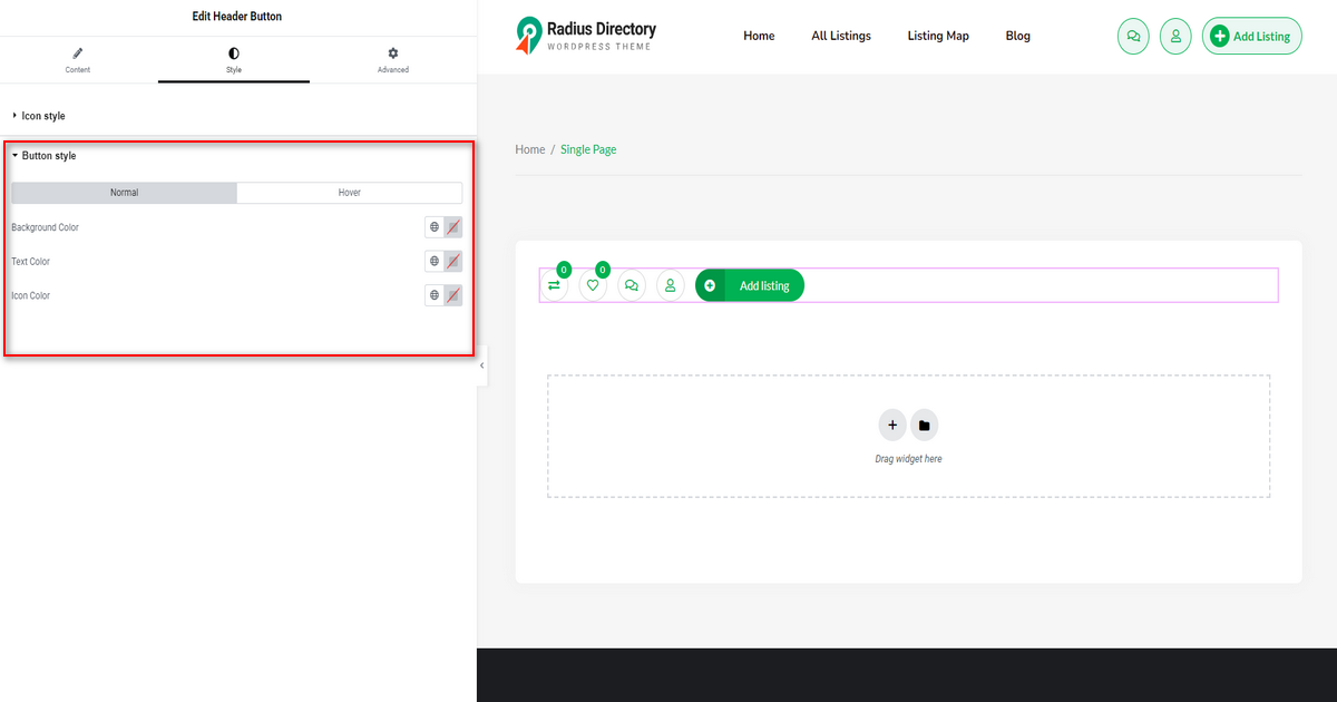
Button style #
You can change the button text and background color using this setting. Note that you can even change the button hover background and text color with it.