On This Page
The heart of any e-commerce store is its products, and every e-commerce store owner wants to sell their products. Some owners remain successful at selling items, while others fail. But why can’t others generate sales?
One of the most common reasons is their product pages, which might be less attractive. Store owners who use these pages may not have researched enough or taken inspiration from the best examples before designing their stores.
You shouldn’t do the same. Instead, examine diverse product pages of popular brands. See what they keep on their product pages and find what makes their pages stand out. You can begin researching with the product page examples listed in this content.
What is a Product Page?
A product page is a traditional web page displaying information about a product customers want. It helps customers learn about the product’s features, dimensions, weight, pricing, shipping fees, and other details.
Many websites neglect product pages or decorate them with interactive elements like size, colors, add-to-cart buttons, etc.
Again, some website owners avoid including basic yet essential informative content on the product pages, such as detailed product descriptions, high-quality product images, customer reviews, product comparison features, etc.
Therefore, their websites fail to attract and keep customers engaged for a prolonged time on the product pages. Eventually, website owners can’t make sales, nor can they generate potential revenue.
You don’t want that thing to happen to you, of course. So, correctly build and design your product pages to catch many eyes and make many sales.
Best Product Page Design Examples for Inspiration
Here are all the best product page design ideas that you can explore to take design inspiration.
1. Lush

At number one, we have Lush, a website of Lush Ltd., a British cosmetics retailer. When we visit the product page of Lush, its simple yet astonishing design amazes us.
It captured our eyes with its high-quality product images and creative thumbnails placed above the fold and on the left side. On the right side, we noticed nicely presented interactive product elements.
Once we scrolled down, we found the product’s detailed information, which was easy to see and read thanks to Lush’s clutter-free layout. We could also easily find the ingredients and reviews.
The entire product page is beautifully and professionally crafted. Therefore, it will please your eyes instead of straining them no matter how long you stay on the page to skim through product information.
Takeaways:
- High-quality product images and creative thumbnails are strategically placed above the fold and on the left side.
- The right side of the page features well-presented, interactive product elements.
- The product details, ingredients, and reviews are displayed in a clutter-free and easy-to-read format.
- The layout is visually appealing and professionally crafted.
2. Allbirds
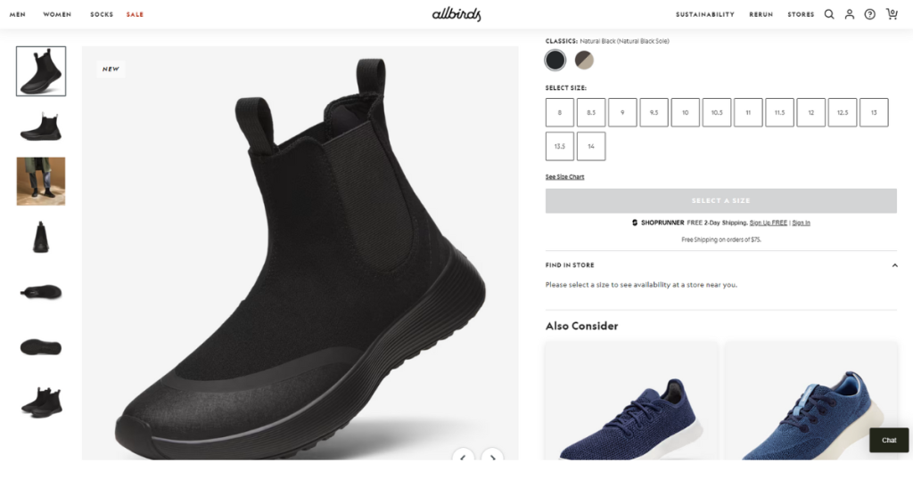
Allbirds is an American public benefit company (PBC) that mainly sells footwear and apparel. When we visited a random product page of Allbirds, we couldn’t help but praise its clean and eco-friendly aesthetic.
Allbirds utilizes high-quality visuals and clearly displays the product. Its product page also includes interactive elements to engage the targeted audience better.
It balances minimalism with detailed product information, making it visually appealing and informative. Lastly, Allbirds utilizes a black and greyish-white color scheme to make the product pages attractive and stylish.
Takeaways:
- Keep your product pages simple.
- Make it clutter-free.
- Utilize professional color schemes to design product pages.
- Include interactive elements and other items to draw attention and boost engagement.
3. Away
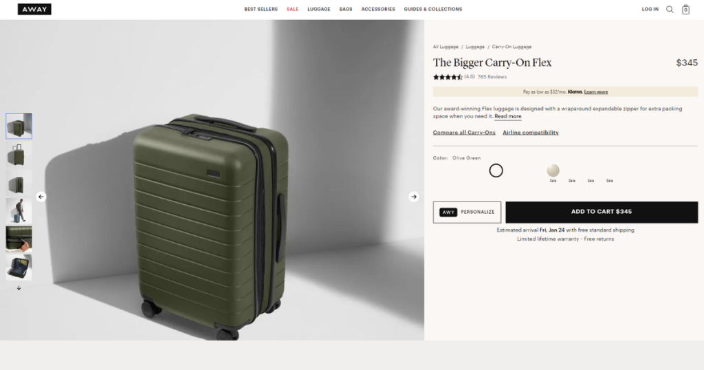
Away is a famous American luggage and travel accessories brand that sells suitcases, travel bags, travel organizers, and other products to consumers.
Away cleverly designed its product pages. When you visit one, you’ll first notice the average product rating and number of reviews. But why did Away place the product rating first above the fold?
According to Forbes, 91% of consumers aged 18 to 34 trust online reviews as much as they trust personal recommendations. That’s why Away displays product ratings and the number of reviews at the top right corner of the page to draw customer attention.
This brand kept the product pages clean and clutter-free. It hid products’ “size & details” and “Warranty & return policy” sections to keep the product pages clean. Customers who want to read those sections can click on their desired section.
Lastly, Away nicely scattered unique and attractive product footage and images throughout the product pages and included customer reviews at the bottom.
Takeaways:
- Prioritize exhibiting product ratings and the number of reviews under product headlines on the product pages.
- Hide long pieces of information to appear clutter-free.
- Answers all the questions your targeted audience may have through product videos and images.
4. Bellroy

If you are struggling with product page design ideas, you can follow Bellroy’s example. This brand’s product pages are similar to those of Amazon.
The significant difference between these two sites’ product pages is how the brands place all the product information and elements throughout them. Structurally, they are similar to the product thumbnail and feature layouts.
Let’s discuss what makes Bellroy stand out: its color palette. This brand uses dark blue in the product feature highlight section as a background. Besides this, a combination of greyish-white and white is visible throughout the product pages.
To highlight essential information and CTAs, Bellroy utilizes orange. Finally, like the other product page examples listed above, this one also maintained a clean and clutter-free design.
Takeaways:
- Bellroy’s product pages are similar in structure to Amazon’s, with comparable layouts for product thumbnails and feature sections.
- Uses dark blue backgrounds in the product feature highlight section.
- Includes greyish-white and white throughout for consistency.
- Orange strategically highlights key information and call-to-action (CTA) buttons.
- Maintains a minimalist, clutter-free design, ensuring usability and visual appeal.
5. Glossier
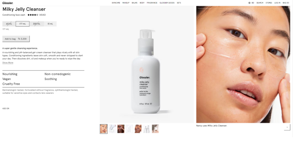
Do you know that optimized product pages can help you attract customers and boost conversions? Glossier knows that, so this brand professionally optimized all its product pages.
The design of this brand’s product pages follows a different path, appearing unique and attractive while offering customers an engaging browsing experience.
Instead of painting the product pages with diverse colors to make them look different, Glossier used a soft white and light pink color palette to design the product pages. That’s why you can clearly view all the essential product information without straining your eyes.
It strategically placed CTAs and included small expandable description sections to elevate the page design and improve user engagement. So, each product page remains easy to skim, clean, and not packed with text.
Finally, Glossier cleverly highlights product benefits and professionally explains how its products can improve your life, leading to increased conversions.
Takeaways:
- Prioritize optimizing your product pages professionally.
- Utilize a color palette to design product pages and enhance clarity.
- Strategically place CTAs and small, expandable description sections to create clean, easy-to-skim pages that boost user engagement.
- Effectively highlight product benefits and explain how your products can improve users’ lives.
6. Missguided

Missguided is a fashion eCommerce brand that professionally designs product pages to improve customer engagement and boost conversion. This eCommerce store captures your attention when you land on its product pages. But how does it do that?
First, it has a clean layout, and all the product-related information is strategically scattered across the product pages. Thanks to its effective CTA placement, you can easily view product information and make purchases.
Unlike many fashion brands, Missguided doesn’t clutter its product pages with tons of product images, videos, and text. Instead, it only displays what adds value to the customers.
For instance, Missguided displays information in expandable sections in addition to high-quality product images. Lastly, this brand focuses on cross-selling its products to increase overall revenue.
Takeaways:
- Add only what customers find helpful on the product pages.
- Focus on building customer trust.
- Grab the opportunity to cross-sell products.
7. Nordstrom
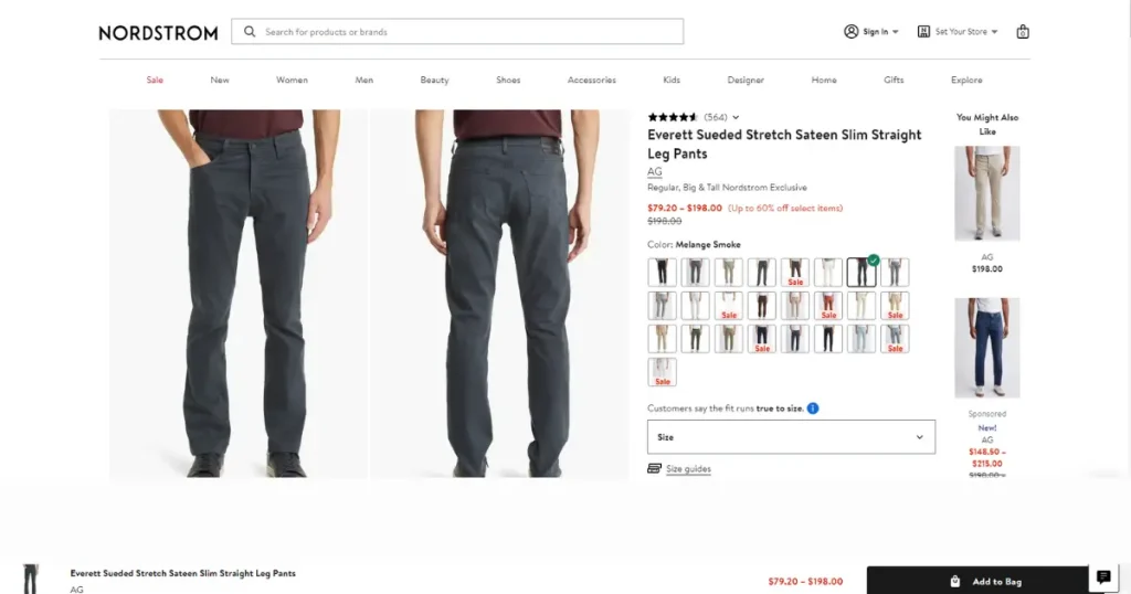
If you seek product page examples or ideas to build product pages on your ecommerce website that attract customers and provide them with an in-store experience, research Nordstrom’s product pages.
When you visit Nordstrom’s product page, you’ll see high-quality product images on the left and product thumbnails on the right, allowing you to check the product outlook thoroughly.
Also, it cleverly uses some nudges to trigger persuasion among customers. You can see how many people are currently viewing the page you are on. This simple tactic keeps you engaged on the product page.
In addition, you will notice a “Free returns anytime” nudge, which will prompt you to place orders without hesitation. On the product page, you’ll also notice a sticky add-to-bag bar, which will encourage you to add the product you see to your cart.
Lastly, Nordstrom’s product pages contain other elements that build trust and boost revenue, such as customer reviews and related product cards for cross-selling.
Takeaways:
- Shows the number of people viewing the product to create urgency and engagement.
- Highlights “Free returns anytime” to remove purchase hesitation.
- Ensures the “add to cart” option is visible, encouraging quicker decisions.
- Displays customer reviews to establish trust.
- Includes cross-selling elements through related product cards.
8. Plantsome

Plantsome’s product pages are clean and have a user-friendly design. Once you browse a product page, you’ll see high-quality product images and other relevant information presented concisely.
Its product page has a seamless layout and bold visuals that emphasize the product’s features. Additionally, every product page has interactive elements, such as size selection and accessory add-ons, to enhance user engagement.
The unique fact about Plantsome is that it uses a few different color palettes for product pages to capture customer attention and increase dwell time.
At the bottom of the product pages, Plantsome answers the most frequently asked questions about a particular product to increase engagement and sales. It also displays similar products for cross-selling.
Takeaways:
- Display large, high-quality images that highlight the unique attributes of a product.
- Make navigation intuitive.
- Use diverse color palettes for a unique shopping experience.
- Include relevant products for cross-selling.
9. Primrose Bakery
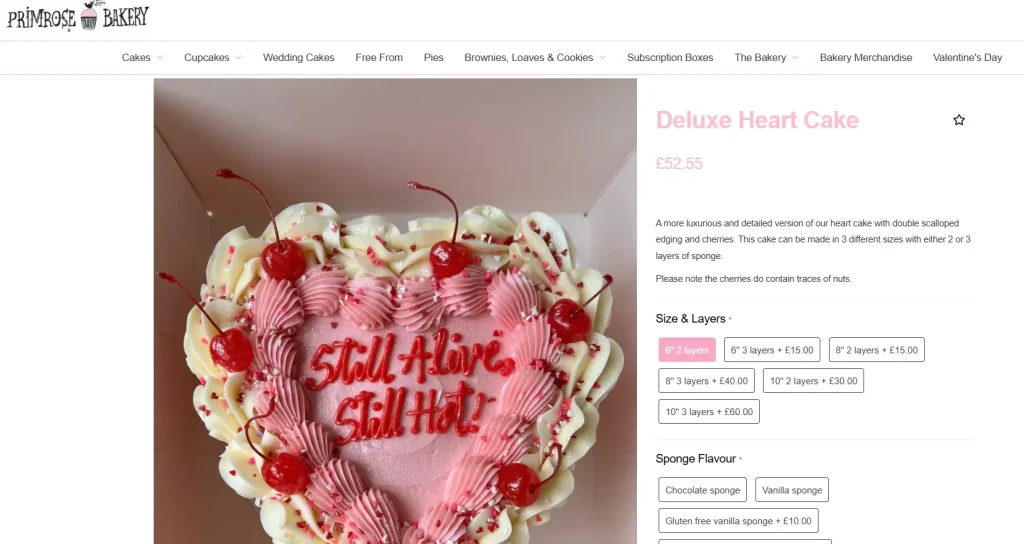
If you want to develop product pages that soothe viewers’ eyes and calm their minds, you may explore Primrose Bakery’s product pages.
This website designed its product pages using a simple approach. Instead of using various color palettes, the primary background is pink.
Additionally, Primrose Bakery adds eye-catching images everywhere to grab potential customer attention. All product pages on this website are clutter-free and promote easy navigation.
Primrose Bakery uses simple yet valuable product pages to draw attention and deliver product-related information—there is no fancy design, complex layouts, or navigation.
Takeaways:
- Use one color palette for the background to create a soothing and visually appealing experience.
- Place eye-catching product images to grab customer attention and enhance visual engagement.
- Keep product pages simple, clean, and easy to navigate.
10. Ralph Lauren
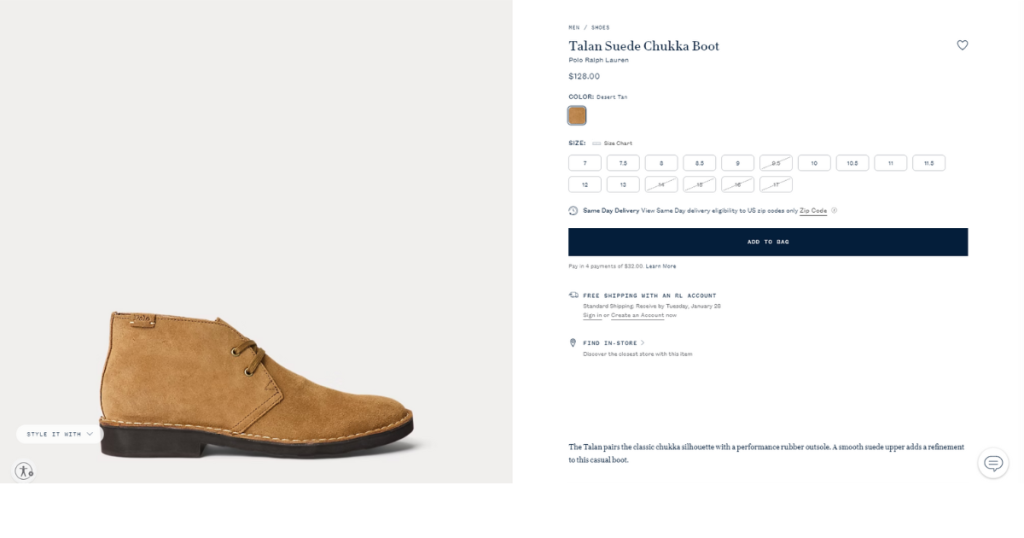
Ralph Lauren’s product pages give you an eye-soothing web page browsing experience, thanks to its carefully thought-out page design.
Its product page is an excellent example of minimalistic design. Ralph Lauren may believe in the principle of less is more, which is why its product pages feature few elements yet attract customers!
Now, let’s discuss the design. Each product page uses a fantastic combination of greyish-white, white, and dark blue color palettes.
Besides this, the main product images and related information are displayed uniquely and attractively. This brand cleverly includes much product information without cluttering the product page—impressive!
Lastly, this website’s product page has a dedicated section for recently viewed items, encouraging customers to purchase products.
Takeaways:
- Consider the “less is more” philosophy while designing the product page.
- Utilize a combination of color tones to deliver a visually pleasing browsing experience.
- Be creative when displaying product images and information.
- Keep the page layout clean and user-friendly.
- Include a dedicated section for recently viewed items.
11. Warby Parker
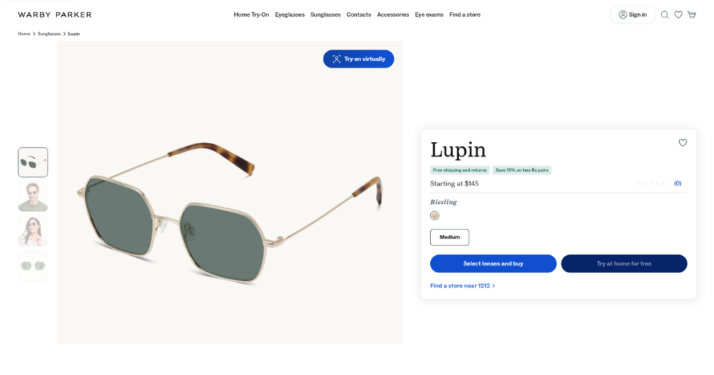
The Warby Parker product has a sleek and premium design that reflects the brand’s luxury appeal. It features high-quality images of the product with different angles and details.
Its layout has clear typography and well-organized sections for product details, customer reviews, and sizing information. Its navigation is intuitive, and this brand strategically uses white space across the product page to enhance readability.
Additionally, Warby Parker adds related product recommendations to product pages to encourage further browsing. This brand effectively balances aesthetics with functionality to enhance the user experience.
Takeaways:
- Include high-quality product images with different angles.
- Properly organize sections for product details and other information.
- Carefully use white space throughout the product page.
- Cautiously choose typography.
- Recommend related products.
12. Apple
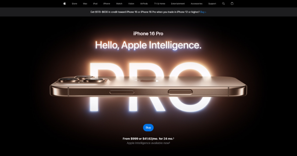
Apple is an immensely popular multinational corporation that manufactures and sells consumer electronics, software, and services.
If you need product page design ideas, study each Apple product page. We are pretty sure you’ll get tons of design ideas. How can we be so sure?
Apple’s product pages, especially the Phone 16 Pro product page, are elegantly designed. This page has an impressive layout and uniquely displays product images and videos from different angles.
Plus, every product copy is cleverly written and presented to lure you into buying the product. Besides all these, Apple uses several effects and interactive elements to make the product page visually appealing.
This is just one product page. If you visit other pages, you’ll notice many more unique design strategies that can help you increase customer engagement and sales.
Takeaways:
- Prioritize creating aesthetically pleasing and functional product pages.
- Be creative while designing the layout and strategically place product images and videos.
- Cleverly craft product copies to engage visitors and entice them to purchase.
- Add visually appealing effects and interactive elements to product pages to enhance user experience and overall visual appeal.
13. Asos

Simple, clean, stylish, modern, and engaging are the adjectives that go with Asos’s product pages. When you visit a product page of Asos, you can’t see different color tones, but you still get a premium vibe.
That means you can design an aesthetic product page without utilizing multiple color pallets. If you look for product-related information, you will find it under the expandable product tabs.
Doing so helps Asos keep the product page clean. Once you start scrolling down, you’ll see other relevant product cards for cross-selling. However, this product page lacks customer reviews and ratings, which is a downside.
However, you should not do the same. Instead, you can take inspiration from its design and include everything in your product pages to draw customer attention and improve sales.
Takeaways:
- Keep the design simple.
- Use expandable sections to display product information.
- Add customer reviews and ratings.
14. Ban.do
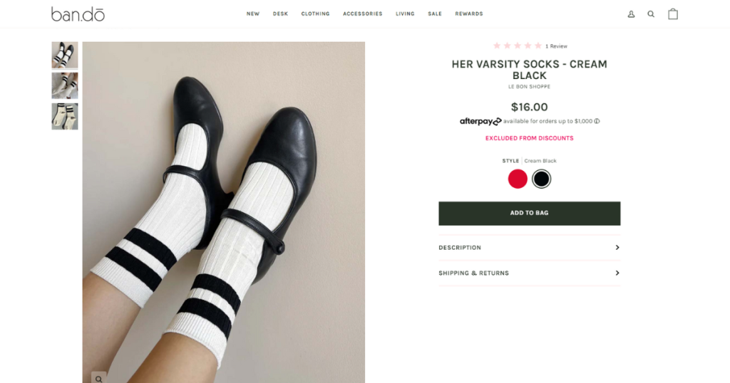
Ban.do’s product pages resemble those of Asos. They feature a clean layout and don’t use diverse color tones.
Therefore, each product page looks simple yet attracts users. This brand implements intuitive navigation on product pages to help web visitors quickly find the information they seek.
Like Asos, this brand also uses expandable sections to display essential product information. It has a dedicated section for relevant products.
Unlike Asos, it’s got a section with a clear CTA titled “WRITE A REVIEW” to gather customer reviews. Additionally, Ban.do’s product page has a separate section to display customer reviews and gain trust.
Takeaways:
- Maintain a clean layout.
- Use a simple design.
- Include a dedicated section to collect reviews
- Display customer reviews
15. Brooklinen
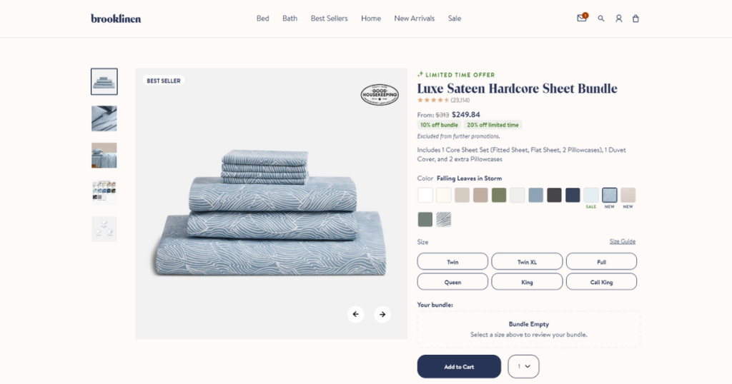
The Brooklinen product page design is clean and user-focused. Its balanced layout effectively combines visuals and information.
Brooklinen displays high-quality product images with a carousel for an in-depth view. The expandable section of its product page contains detailed product descriptions.
This brand focuses on gaining customer trust. To affirm consumers about the quality of the product, it places product ratings and the number of reviews underneath the product title. The page also includes customer reviews to build trust.
Its product page has sections like “Our Most Loved” and “Shop the Collection” to encourage browsing and cross-sell products. Brooklinen prioritizes simplicity and functionality and cleverly designs product pages to give customers a premium feel.
Takeaways:
- Design clean and user-focused product pages
- Add carousel to display primary products
- Keep expandable sections for product descriptions
- Highlight customer ratings and reviews
- Recommend relevant products
What Are the Best Practices for Product Page Design?
A powerful and engaging product page is necessary to draw customers’ attention and convert them into paying consumers.
We’ve already seen some of the best product page examples to help you gather design ideas. It’s time to look at what to include in a product page. With that said, let’s get straight into it.
High-Quality Product Images and Videos: Include high-resolution product photos. Remember to take shots from different angles. Also, use images of diverse sizing and add variation swatches to let users easily visualize product variations. Besides this, include high-quality product videos.
As you know, your first impression matters, and this principle also applies to your product photos and videos.
Detailed Product Descriptions: Shoppers must understand your product’s features and benefits before confirming orders. Hence, include detailed product descriptions on each product page of your online store.
Customer Ratings & Reviews: A general store becomes a brand by gaining customer trust. It achieves that by being transparent and displaying customer ratings and reviews.
Thus, you must include these trust-building elements in your product pages.
Add Product Cost and Other Fees: Some stores avoid displaying product prices and shipping fees on the product page. Instead, they exhibit pricing and shipping fees at checkout.
You should not do this. To appear transparent, include the product price, discounts, taxes, shipping costs, and other fees on the product page.
Clear CTAs: Add clear CTAs across your product page to encourage customers to take action. Follow the best product page examples listed above to scatter these call-to-action buttons throughout the product pages strategically. For more inspiration, check out these eCommerce Checkout page examples.
Product Status: Imagine you have a hot product in your store. Suddenly, it goes out of stock, and you don’t notify the customers. As a result, customers place orders and wait days to receive the product.
Eventually, customers cancel orders, which is bad for your store. Thus, always inform customers about the product status on the product page. If a product is not available, announce it. Also, allow customers to place orders for out-of-stock items.
Notify them when their desired products become available. If your store is built on WordPress, you can easily automate this job using the ShopBuilder plugin.
Suggest Related Products: Virtually all e-commerce shops recommend similar products on the product pages. You can do the same and enjoy the benefit of upselling and cross-selling.
Create High-Converting Product Pages
You’ve already seen all the best product page examples and know what to keep on your product pages. Now, it’s time to implement what you have learned.
Carefully design the product pages, following design best practices. If necessary, seek help from experts and use ShopBuilder to build a high-converting WooCommerce store.