
The fourth step of the shortcode generator is Styling. Navigate WordPress admin menu Food Menu => Shortcode Generator =>Styling
You can set all style primary color, text size, text color, and alignment from here.
There are also some PRO features.
The Styling tab lets you customize the visual appearance of your menu layout with colors, fonts, and design elements. These settings help match the menu to your website’s branding and design.
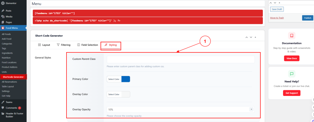
1. General Styles #
- Custom Parent Class – Enter a custom CSS class to add your own styling rules.
- Primary Color – Fix the main accent color used throughout the menu (e.g., for highlights, active states).
- Overlay Color – Determine the color of image overlays that appear on hover.
- Overlay Opacity – Set the transparency of the image overlay (e.g., 10% for subtle, 80% for strong).
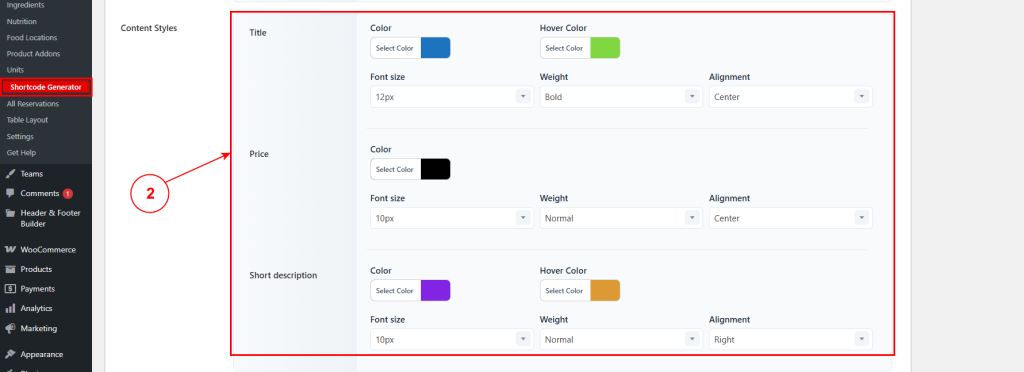
2. Content Styles #
Customize the typography and colors for different content elements:
- Title – Set the title text color and hover color for when users move their cursor over the title. Configure the font size (e.g., 12px), font weight (e.g., Bold, Normal), and text alignment (e.g., Center, Left, Right).
- Price – Configure the price text color, font size (e.g., 10px), font weight (e.g., Normal, Bold), and text alignment to display pricing information clearly.
- Short description – Set the description text color and hover color. Adjust the font size, font weight, and text alignment to ensure the item description is readable and visually appealing.
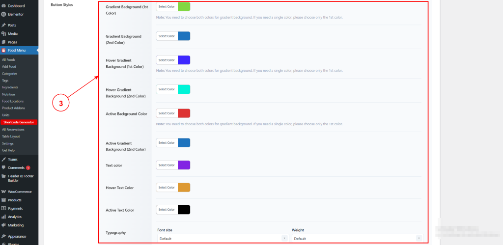
3. Button Styles #
Customize the appearance of buttons (Read More, Add to Cart, etc.):
- Gradient Background (1st Color) – First color for button gradient. For solid color, use only this field.
- Gradient Background (2nd Color) – Second color for button gradient. Leave empty for solid color.
- Hover Gradient Background (1st Color) – First hover gradient color.
- Hover Gradient Background (2nd Color) – Second hover gradient color.
- Active Background Color – Background color when button is clicked/active.
- Active Gradient Background (2nd Color) – Second color for active gradient.
- Text color – Button text color.
- Hover Text Color – Text color on hover.
- Active Text Color – Text color when active.
- Typography – Button font size and weight.
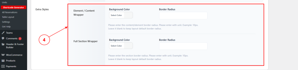
4. Extra Styles #
Element / Content Wrapper
- Background Color – Background color for individual menu items.
- Border Radius – Rounded corners for menu items (e.g., 10px). Leave blank for default.
Full Section Wrapper
- Background Color – Background color for the entire menu section.
- Border Radius – Rounded corners for the menu section. Leave blank for default.


