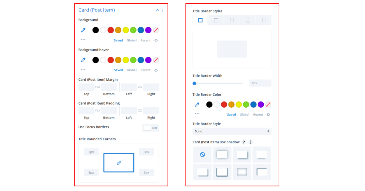
There are 11 sections in the Design Tab. Every section of the style tab will display depending on the Field Selection and layout. That means if you hide any section from
[ Settings > Field Selection ], then it will not appear in the Style Tab section.

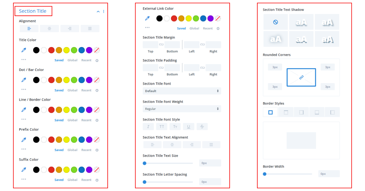
1) Section Title:
Alignment: Adjust the alignment.
Padding: You can provide padding on all axis for the section title.
Typography: You can change all kinds of Typography (Font family, size, line height, etc.) for the section title from here.
Title Color: Change the section title color.
Dot Color: Change the title’s dot color. (If you use the section title style 1 then the below field will display. You can change the style from [Settings > Section Title Style])
Title Background Color: Section title background color. (If you use the section title style 2 or 3, then the below field will display. You can change the style from [Settings > Section Title Style])
Line / Border Color: Change line/border color.
2) Post Title:
Title Minimum Height: Enter the title margin to make spacing.
Title Padding: Enter title padding if needed.
Typography: Change title typography (Font family, size, line height, etc.).
Alignment: You can change the title alignment from here.
Normal/Hover/Box Hover Tab: You can change the title color, background color, and hover border color from here. Also, you can change all for on Hover and on Box Hover. Box hover means when a postcard hovers.

3) Thumbnail:
Border Radius [Pro]: Enter thumbnail border-radius.
Image Width (Optional): This is an optional field. If you choose Default from here, then the image will stretch automatically with the postcard. But if you want to change it, then you can change it to other values.
Thumbnail Margin: If you want, then can use a thumbnail margin. Most of the time, you needn’t change this field.
Overlay Background Type: You can add the overlay background color or gradient color for the thumbnail overlay normally and on hover.

4) Excerpt / Content:
Typography: You can change excerpt typography (Font family, size, line height, etc.) from here.
Excerpt Spacing: You can add spacing on all sides of the excerpt.
Alignment: Change excerpt alignment.
Excerpt color: Change excerpt color on hover and on postcard hover.

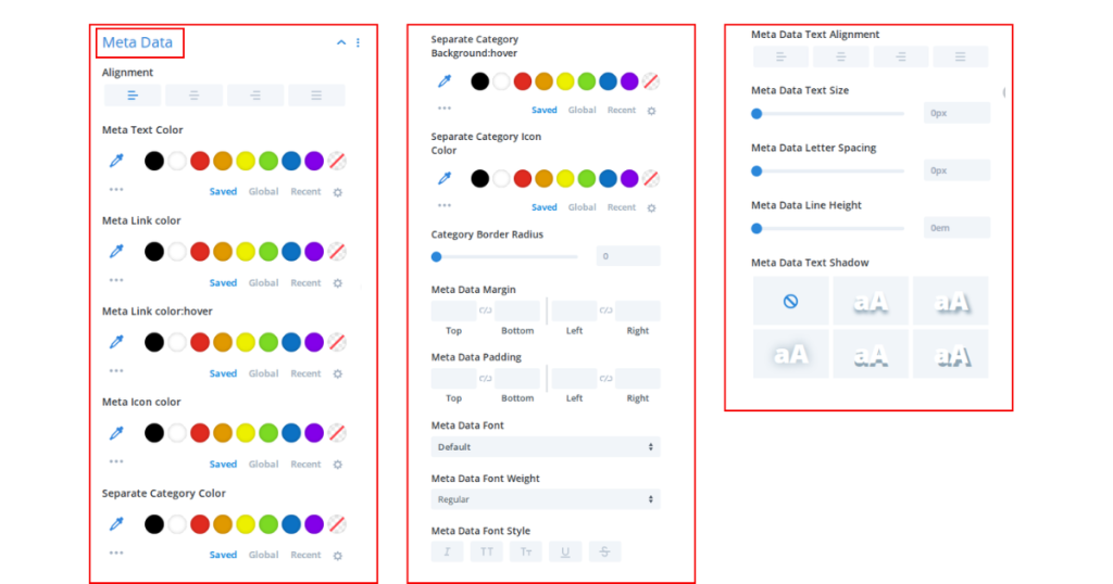
5) Meta Data
Typography: Change meta typography (Font family, size, line height, etc.) from here.
Meta Spacing: You can add meta spacing if you need.
Normal/Hover/Box Hover Tab: You can change all Meta text colors, Meta link colors, Meta separator colors, Meta icon colors, Only category colors, and category background colors from this tab. And also, you can apply all for a normal meta, on meta hover, and on postcard hover
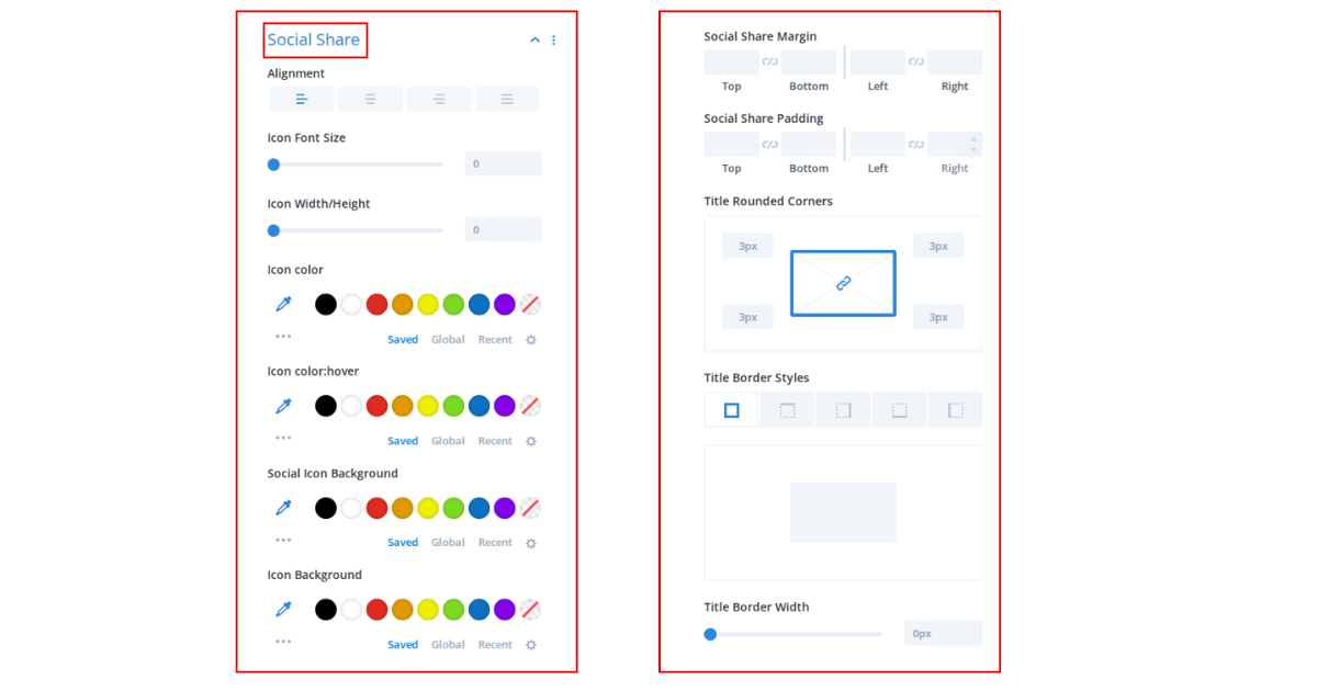
6) Social Share
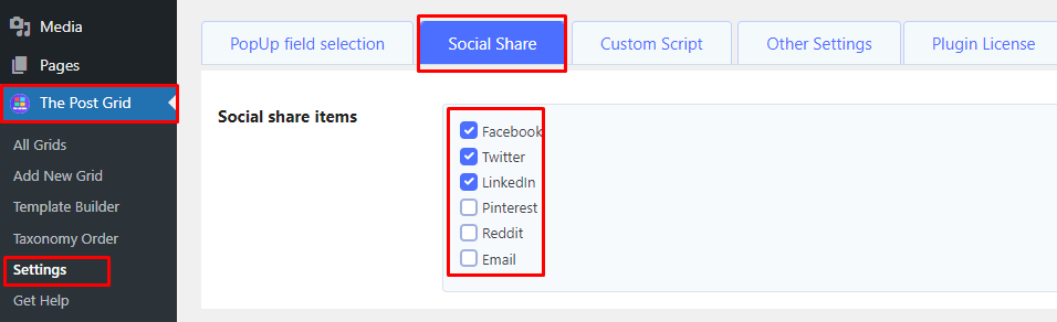
Choose Social Icon: To choose the social icon first, you have to go to [ Dashboard > The Post Grid > Settings > Social Share ]. Now you can check social icons from this list. Please see the screenshot below for more details:
After choosing social share, please follow the steps below for the Elementor style:
Icon Color Style: There are 3 options for changing all social icons. By default, the brand color will display. But you can apply different colors for each icon or only one color for all icons from here. If you change here, then some color field will display on the NORMAL / HOVER tab.
Icon Margin: You can add icon spacing from here.
Icon Wrapper Spacing: You can add icon wrapper spacing from here.
Border Radius: Enter the icon border-radius from here.
Icon Dimension: You can set icon width and height from here. After entering the value, you have to click the APPLY button to change it.
Icon Font Size: You can change the icon font size.
Normal/Hover Tab: This tab contains all colors, borders, and background-specific styles. Some fields can be shown and hidden depending on the Icon Color Style option.
7) Read More
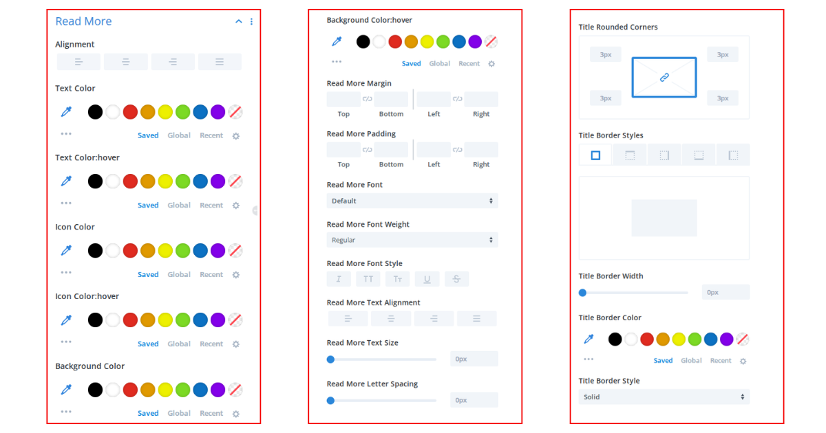
Normal / Hover / Box Hover Tab: You can change the button text color, Icon Color, background color, border radius, border, etc, for the normal button, on the hover button, and on the postcard hover from this tab.
Typography: If you want, you can change the Read More button typography (Font family, size, line height, etc.) from here.
Button Spacing: You can add button spacing from here.
Button Padding: If you want, you can add extra padding for the button from here.
Button Alignment: Choose button alignment.
Button Icon Style: The following styles will display if you enable the Show Button Icon button from [ Settings Tab > Read More ]
Icon Position: You can change the icon position to left or right.
Icon Size: Change icon font size from here.
Icon Vertical Position: If you need then you can tune the icon vertical position manually from here.
8. Front End Filter
Some fields can be shown or hidden depending on the filter settings from [ Content > Filter ]
Filter Typography: You may change filter typography (Font family, size, line height, etc.) from here.
Vertical Alignment: Change filter vertical alignment from here.
Border Radius: Enter the front-end border-radius from here.
Normal / Hover-Active Tab: You can change the Filter text color, background color, border color, etc, for the normal filter and on the hover/active Filter from this tab.

9) Pagination
Some fields can be shown or hidden depending on the filter settings from [ Content > Filter ]
Alignment: Change the filter vertical alignment from here.
Typography: You may change pagination typography (Font family, size, line height, etc.) from here.
Border Radius: Enter the front-end border-radius from here.

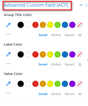
10) Advanced Custom Field (ACF)
Group Title Color: Adjust the color.
Label Color: Determine the label color.
Value Color: Customize the color of the value.
11) Card
Card Normal / HoverTab: You can change the Card background, Border color, and Box shadow for the normal card and on the hover of the card from this tab.
Card Margin: Enter the card gap between each other.
Content Padding: Enter content padding if needed.
Card Border Radius: Enter the card border-radius from here.
Enable Border & Box Shadow: You can enable or disable card border-radius and box-shadow.